Offbeat Eats
Food Festival Branding
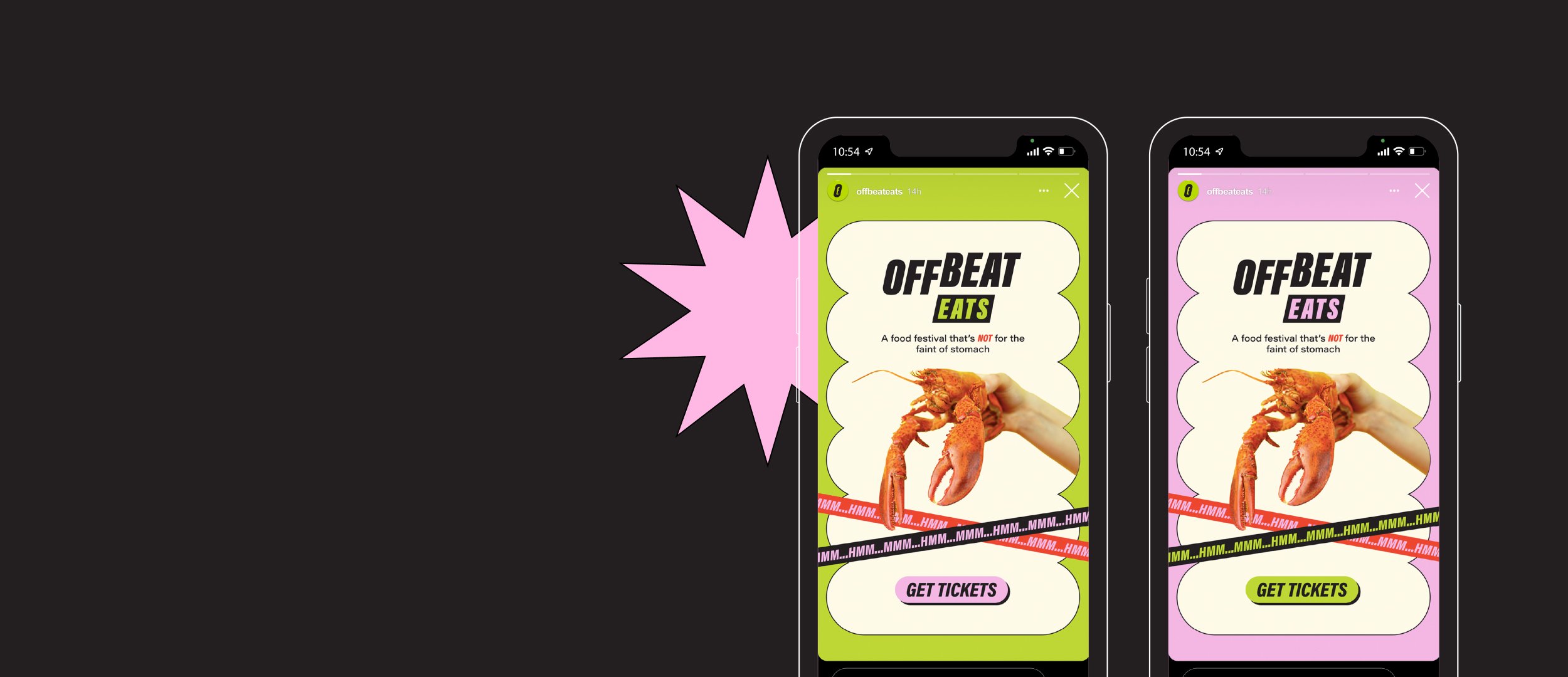
Vibrant, in-your-face brand design for a food festival that’s NOT for the faint of stomach.
CLIENT
Offbeat Eats Food Festival
INDUSTRY
Food
SERVICES
Brand Design
I designed this vibrant, colorful branding for Offbeat Eats, a food festival showcasing experimental, up & coming restaurants and food products. Just be warned: They’re NOT for the faint of stomach.
This project was created as part of the course "Experiencing Brands Through Interaction Design" at the School of Visual Arts.
All photography is from Unsplash and FoodiesFeed. Photographer credits: Adrien Olichon, Elena Koycheva, Pulsitos, Shaun Meintjes, Toa Heftiba, and Jakub Kapusnak
BACKGROUND
Offbeat Eats caters to Gen Z / Millennial foodies in the San Francisco Bay Area. You know, the Yelp Elite / Instagram food influencer type. They’re both adventurous eaters and conscientious foodies. These customers care a lot about sustainability, locality, and diversity!
Offbeat Eats Food Festival meets this need by showcasing innovative, experimental foods while highlighting up-and-coming food businesses. Supporting local businesses & their delicious food? It’s a win-win.

BRAND IDENTITY
The direction for this brand highlights the restaurants and food brands that are pushing the envelope in the culinary scene.
The vibrant colors, bold photography, and dynamic typography bring to mind the innovative cuisines and products that are being showcased in the festival.
The branding of this food festival aims to be experimental and out-of-the-box without being stuffy and elitist.